My Health Online
Enhancing patient experience through simplified navigation and usability of high impact features within MHO
Enhancing patient experience through simplified navigation and usability of high impact features within MHO
Patients using the MHO app struggle to find key features like scheduling appointments due to buried navigation. This confusion leads to missed actions, user frustration, and added burden on hospital staff who must follow up manually.
Increase patient engagement and reduce operational inefficiencies by improving navigation and usability of high impact features within MHO, particularly scheduling appointments.
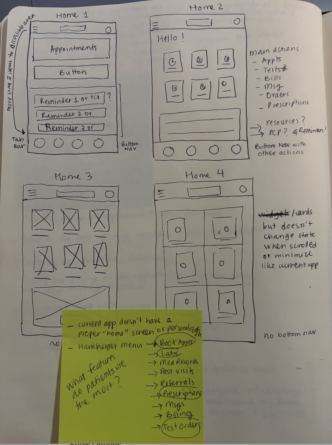
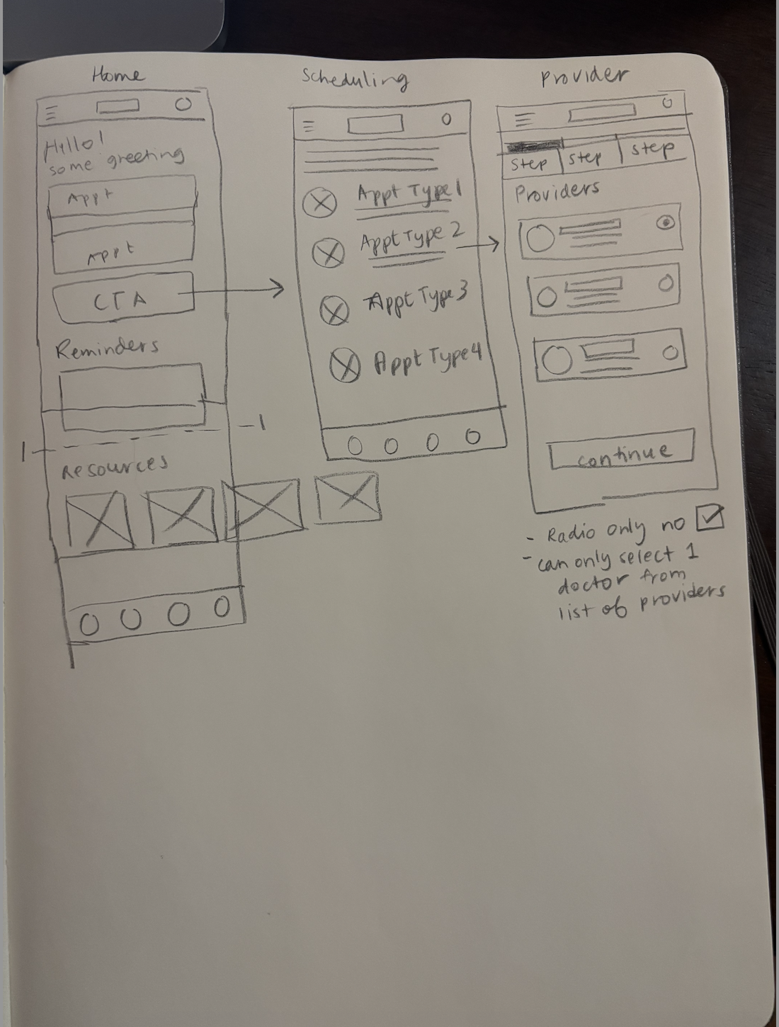
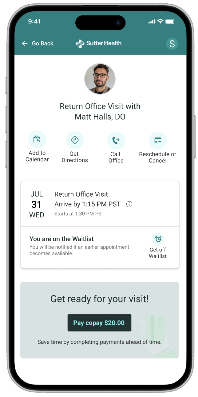
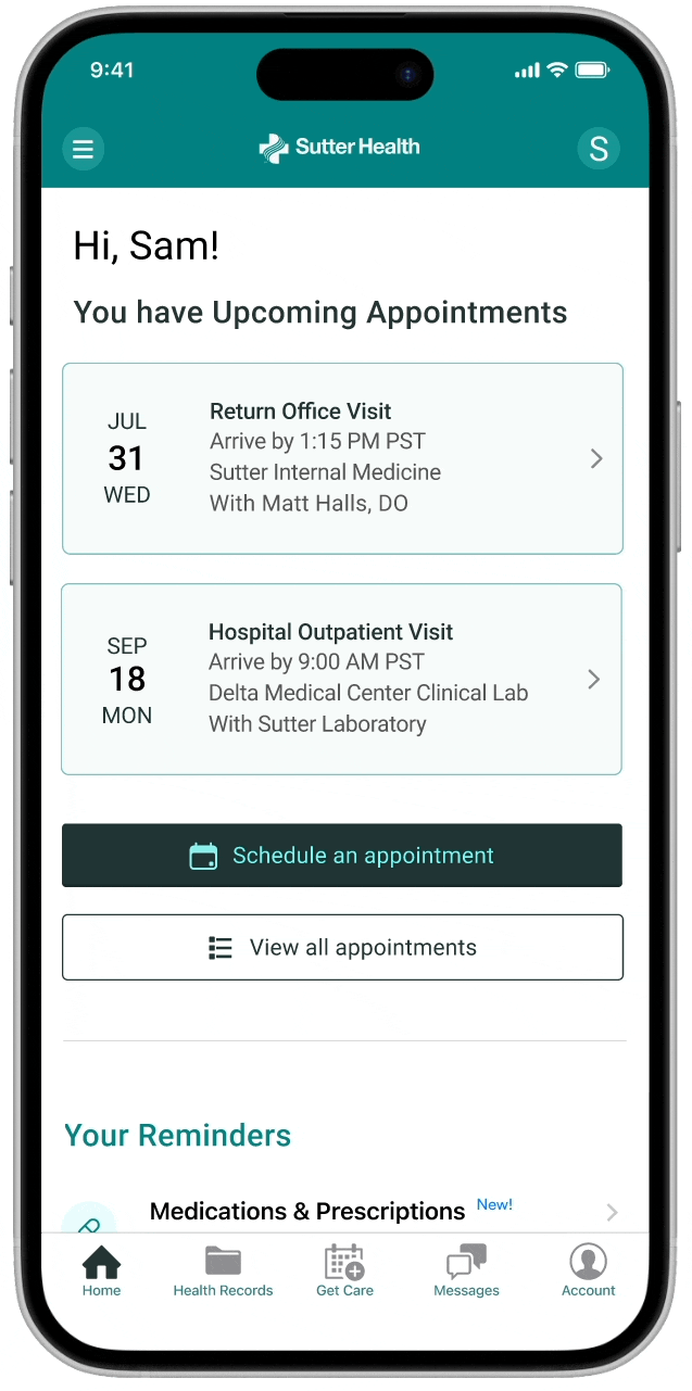
I led the design to improve MHO app's navigation experience. This included identifying usability gaps, analyzing competitive patterns, gathering stakeholder and user input, and designing prototypes that reimagined key task flows like scheduling appointments, all within existing platform constraints.

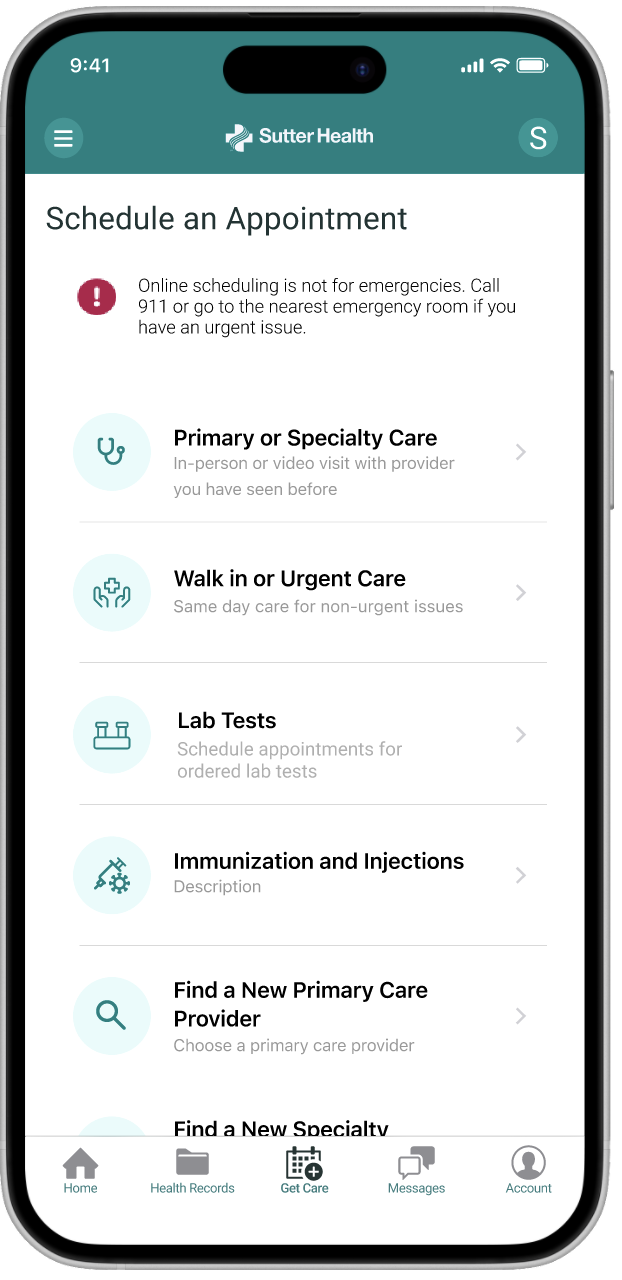
The main challange with MHO was unclear labels and buried navigation. Patients couldn’t easily find or recognize core actions, making important tasks like scheduling appointments hard to complete.
Although it seemed like a straightforward task, scheduling involved multiple appointment types, each with a different user flow (e.g., primary care, lab tests, imaging). Through conversations with lab managers, I discovered that lab appointments were the most misunderstood.